The 8 Best Whole Home Beige & Tan Paint Colors
When painting every room in your home, it can be hard to find that one magical color that works in every room. Not only does it need to humor a range of interior finishes, but it has to flex with varying exposures and suit your personal tastes!
This means you need a real workhorse – a color that does double-duty and then some. Whereas you won’t get enough flexibility with actual ‘colors’, warm neutrals are more flexible than me in Grade 12 (toes to noes, baby – if Tim only knew me then…).
We’re going to take a look through some of my Designer-recommended beiges and tans. These, along with my other blog posts on the best whole-home colors (links provided later), should have you well on your way.

But first, you know I’m not just a ‘show you some pretty images and tell you what to do‘ kind of blog. Instead, I want to help you understand the whats and whys, and then we’ll hit the good stuff. So, let’s have a chat…
THE 4 UNDERTONES OF WARM, NEUTRAL PAINT COLORS
One thing that makes me giggle (other than people tripping and random gas) is when my warm-lovin’ clients say, ‘I want a warm paint color, but I don’t like yellow, orange, pink, or red undertones’... insert awkward whistling here.
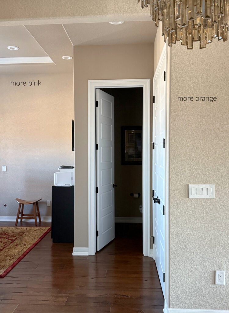
Every warm neutral will have a yellow, orange, or red (pink) undertone and sometimes even a wink o’ green—#TRUTHBOMB. I can certainly suggest warm neutrals with reduced undertones, but youhave to pick your poison. This is usually the one that best suits the finishes in your home rather than your personal tastes.
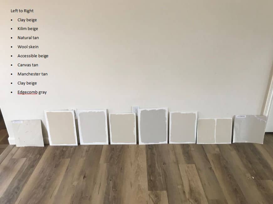
I see you eyeing the above colors. We’ll look at many of them shortly.
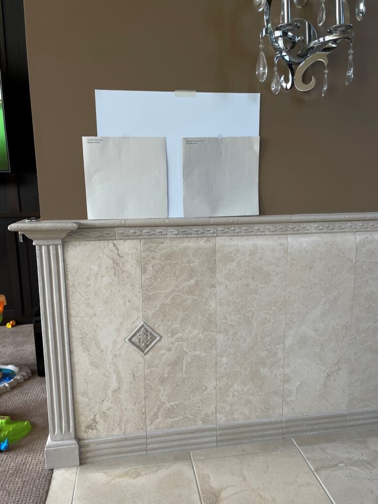
a) Never lean your samples as shown in the above image. Light reflects differently from angled surfaces than horizontal or vertical ones. ALWAYS place your samples perfectly vertical.
b) Colors will look different in your natural light – heck, they’ll look different from room to room – never judge a color by how it looks here. Sample and compare your top choices in your own home!
Now, let’s talk about what you need and why (other than a stiff drink).

YOU NEED A VERSATILE, LIGHT COLOR
If you’re looking for a warm beige paint color suitable for your whole home, it needs to…
- Be flexible enough to suit a wide range of finishes, including kitchen countertops, bathroom tiles, and bedroom carpets.
- Look good in different exposures and interior lighting conditions.
- Hopefully, it suits your personal tastes!
The best way to satisfy the above is to choose a warm, off-white, or light (depth) paint color with an LRV between 60 (preferably 65 for me, but you do you) and 73.
LRV stands for Light Reflectance Value and more or less tells you how light or dark a color is on a scale of 0 (black) to 100 (white). There’s more to it than that, but that’s the meat n’ potatoes (no gravy).
Why?
The darker a color is, the less likely it is to suit a wide range of finishes and lighting conditions. The light-medium color that was perfect in your well-lit living room looks heavy and drab in your low-light basement. That white, which was awesome in your kitchen, looks stark and cold in your north-facing bedroom. And so on.
The reality is that sometimes there isn’t one magical paint color that suits EVERY finish, EVERY lighting situation, and EVERY personal taste. Sometimes you need to forgive a color its flaws, or consider a 2-3 color palette.
And it’s not the color’s fault. It’s usually because the interior finishes of a home aren’t coordinated enough on a large scale, or the lighting shifts dramatically from one space to another.
Now it’s time to sit on your cute lil’ petunia and get ready for some colors…
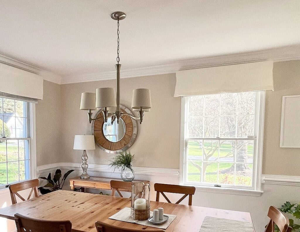
1. SHERWIN WILLIAMS NATURAL LINEN 9109
I had to start with my favorite. Natural Linen is a light beige paint color with amazingly balanced undertones. With a focus on orange (being a beige, it makes sense), it can flex with a range of finishes.

As for depth, its LRV of 66 puts Natural Linen in a great position to suit a range of natural and interior lighting conditions (too much light/not enough/etc).

WHY NATURAL LINEN IS A GOOD WHOLE HOME COLOR…
- Natural Linen is a more modern, updated shade of beige – nothing like the rich, golden beiges of the early 2000s that many still have PTSD from (some of which are coming back).
- Its flexible undertones suit a wide range of interior finishes, including tricky carpets, tiles, and countertops.
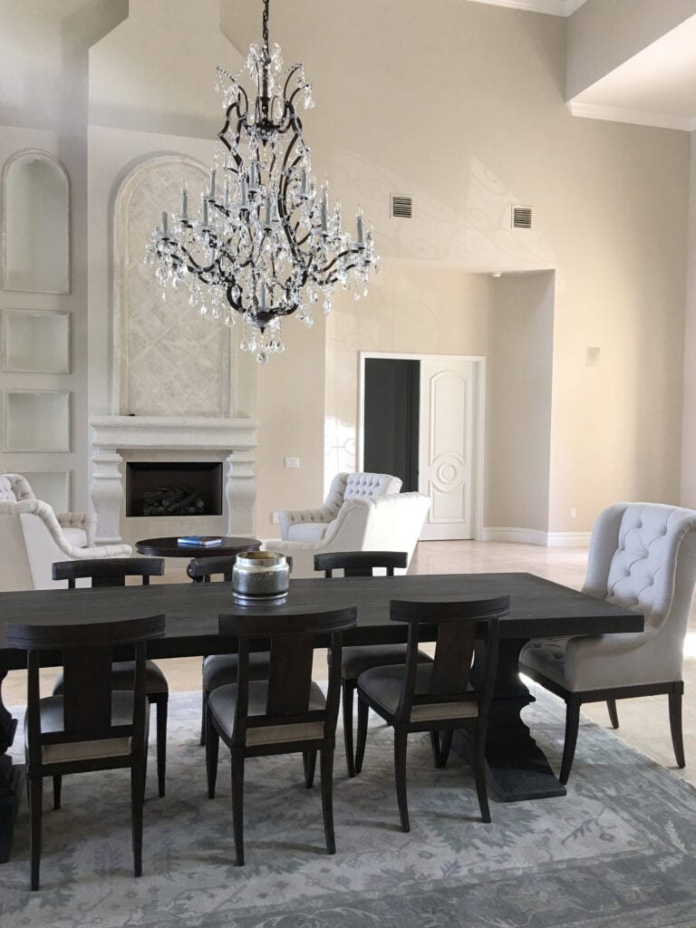
- Natural Linen is one of the best neutral paint colors (on the warm side) for the ‘average home with average finishes’.
Sherwin Williams Natural Linen Color Review
2. BENJAMIN MOORE MUSLIN OC-12
Before I fell in love with Sherwin Williams Natural Linen, there was Muslin. Don’t get me wrong, I still love Muslin, but I prefer Natural Linen for one big fat reason (we’ll get to that shortly).
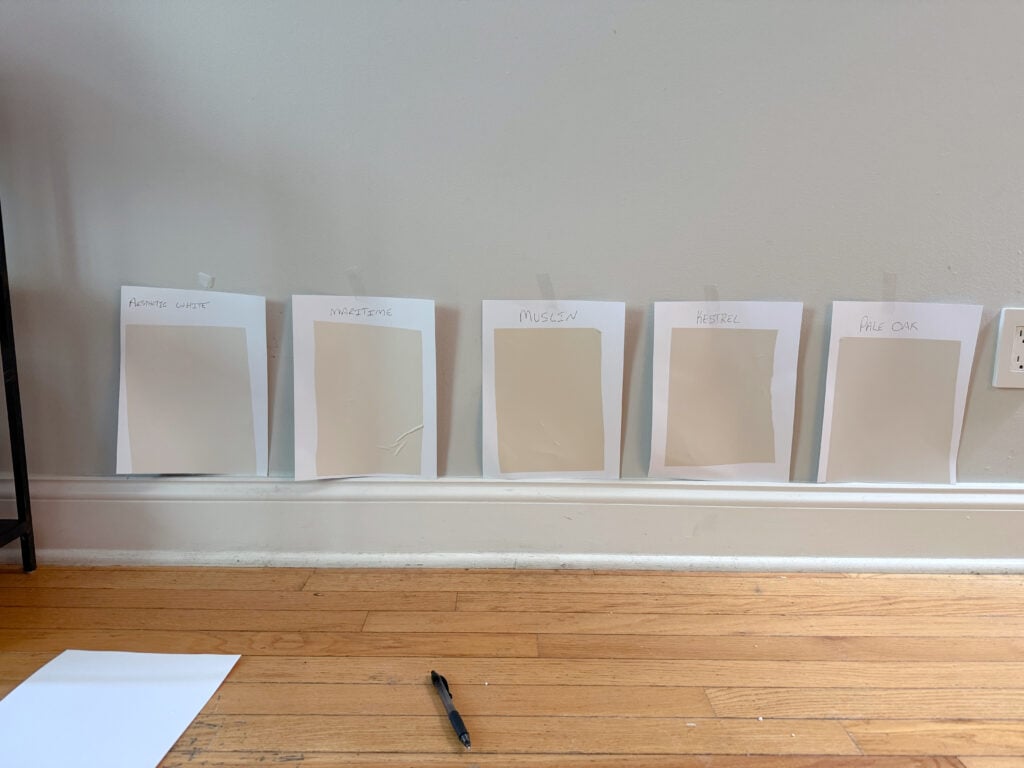
REVIEWS: SW Aesthetic White | BM Maritime White | SW Kestrel White (BM website) | BM Pale Oak – some of these are coming up shortly!
Muslin is a light beige, so it’s warm. It centers nicely on its orange undertone with some good flexibility towards finishes that lean slightly orange-yellow or orange-pink.
As for depth, Muslin’s LRV of 66.54 parks its purdy little butt right in the middle of the light world.

Now, the main reason why I prefer Natural Linen is that Muslin’s undertones are slightly stronger.
While they both have similar intentions, Muslin is stronger with its approach. This is why sampling and comparing 4-6 similar shades is so FRIGGIN’ important, as you never know what look your finishes and lighting will suit best!
Benjamin Moore Muslin Color Review
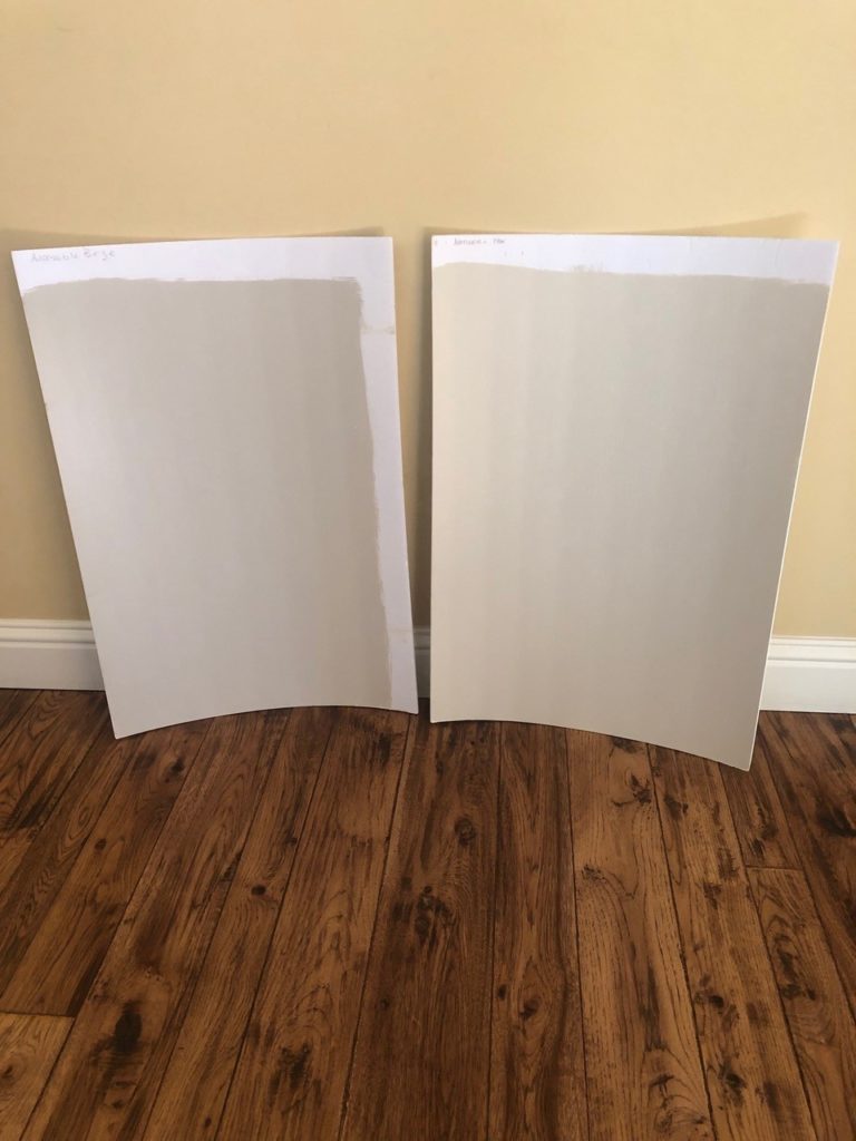
3. SHERWIN WILLIAMS ACCESSIBLE BEIGE SW 7036
Shifting gears a bit, let’s look at one of Sherwin Williams most popular paint colors (currently), Accessible Beige.
Unlike the above colors, Accessible Beige is a bit moodier (especially at its time of the month – HOLA!). It’s a light beige, but it’s very unusual as it leans slightly into gray. And while it could be encouraged OHHH so slightly green, it’s so vague that I’m just being anal (one of my redeeming qualities) – ignore me.
While Accessible Beige isn’t for every home (no color is), if you have a well-lit home with easy-to-please finishes, it could be a good choice.
With an LRV of 58, Accessible Beige carries a bit more visual weight than the average ‘light’ depth paint color. This means you’ll see more contrast with white trims.
Do you want my personal opinion of Accessible Beige?
Personally, I don’t love it for a ‘whole home’ use, it gets my titties all in a tussle. So, why include it? Because it’s not all about me, and SO MANY PEOPLE love this darn color!
Accessible Beige: Timeless Neutral or Dated Dud?
WHY KYLIE M. IS HESITANT…
- Accessible Beige’s depth of 58 puts it on the lower end of the light range. If you have a few dark rooms and hallways, it can look a bit dull, murky, and dingy.
- Because it can flash green (at very odd times), it can be hit-or-miss with some of the more popular beige-inclined interior finishes.
Review of Sherwin Williams Accessible Beige
OTHERWISE, WHY IS IT A GOOD WHOLE-HOME COLOR?
- Accessible Beige offers the passive warmth of beige without any overly golden hues.
- Some people want a bit more depth on their walls and contrast with their trims – especially in super bright homes.
- For those who like the IDEA of beige but are nervous of the traditional orange undertones, Accessible Beige can be a great mediator.
4. SHERWIN WILLIAMS BALANCED BEIGE SW 7037
Balanced Beige is one tone down from Accessible Beige on the same color strip. And just like Accessible, it leans a touch into gray and can look almost greige-taupe in some lighting, especially north-facing rooms.
Balanced Beige has an LRV of 46, making it a solid light-medium paint color. If you have a home with great natural light, you might appreciate that it has a bit more depth and can withstand intense natural light better than an off-white or light-depth paint color. However, make sure it still looks good in any darker rooms or hallways.
I won’t say that Balanced Beige is a win for a ton of homes, but for the odd person who wants more depth, this is a great option.
Here’s your Peel & Stick sample of Balanced Beige…

REVIEW of Sherwin Williams Balanced Beige
WHY IS BALANCED BEIGE A POPULAR PAINT COLOR
- Like Accessible Beige, Balanced Beige offers a more SUBTLE take on warmth.
- It doesn’t have overwhelming undertones; in fact, I find them a bit more usable than Accessible Beige’s.
- Balanced Beige offers a bit more contrast with white trim without weighing down the average room. While it’s darker than Accessible Beige, I like that it’s purposely darker, whereas I wish AB were a bit lighter.
- If Balanced Beige is up your alley, check out this blog post for similar shades: The Best Slightly Darker Beige & Tan Paint Colors
- On the other hand, if you love more traditional golden beiges, you may find Balanced Beige a bit too greige-taupe looking, as it doesn’t cast that typical golden glow.
5. SHERWIN WILLIAMS AESTHETIC WHITE 7035
While an argument can easily be made whether Aesthetic White is beige or not, it has some great beige tendencies. This makes it worth sampling and comparing it to similar shades.
Aesthetic White in south-facing light on a cloudy day.
Aesthetic White is an off-white beige paint color thanks to its LRV of 73. However, compared to a warmer beige like Maritime White (which we’re looking at next), Aesthetic White has a buttload of gray in its blend. How much this gray shows up depends on your room’s exposure and interior lighting situation.

WHY AESTHETIC WHITE IS A GOOD WHOLE HOME OPTION…
- It’s a simple color with a super passive warmth, so you won’t be smacked upside the head with undertones or temperature.
- If you’re over gray, but not ready for beige, Aesthetic White can be the perfect bridge.
- If Aesthetic White hits your happy place, you might also enjoy: The Best Whole Home Off-White Paint Colors, as well as the next color listed below!
Sherwin Williams Aesthetic White Color Review
5. BENJAMIN MOORE MARITIME WHITE 963
If I had to choose one color, my ‘Designer-approved, whole home, warm neutral paint color for the average home’, it would be Maritime White.
Will it suit every home? Hellllls no, no color will. However, its moderate approach to depth (motorboating in the ample bosom between off-white and light) and degree of color makes it a win for so many spaces.
Maritime White has an LRV of 71.6, making it an off-white to light beige. It has an orange undertone (as beiges do) with great flexibility to the passive undertones that surround the average beige-lovin’ interior finish.
Here’s your Peel & Stick sample of Maritime White…
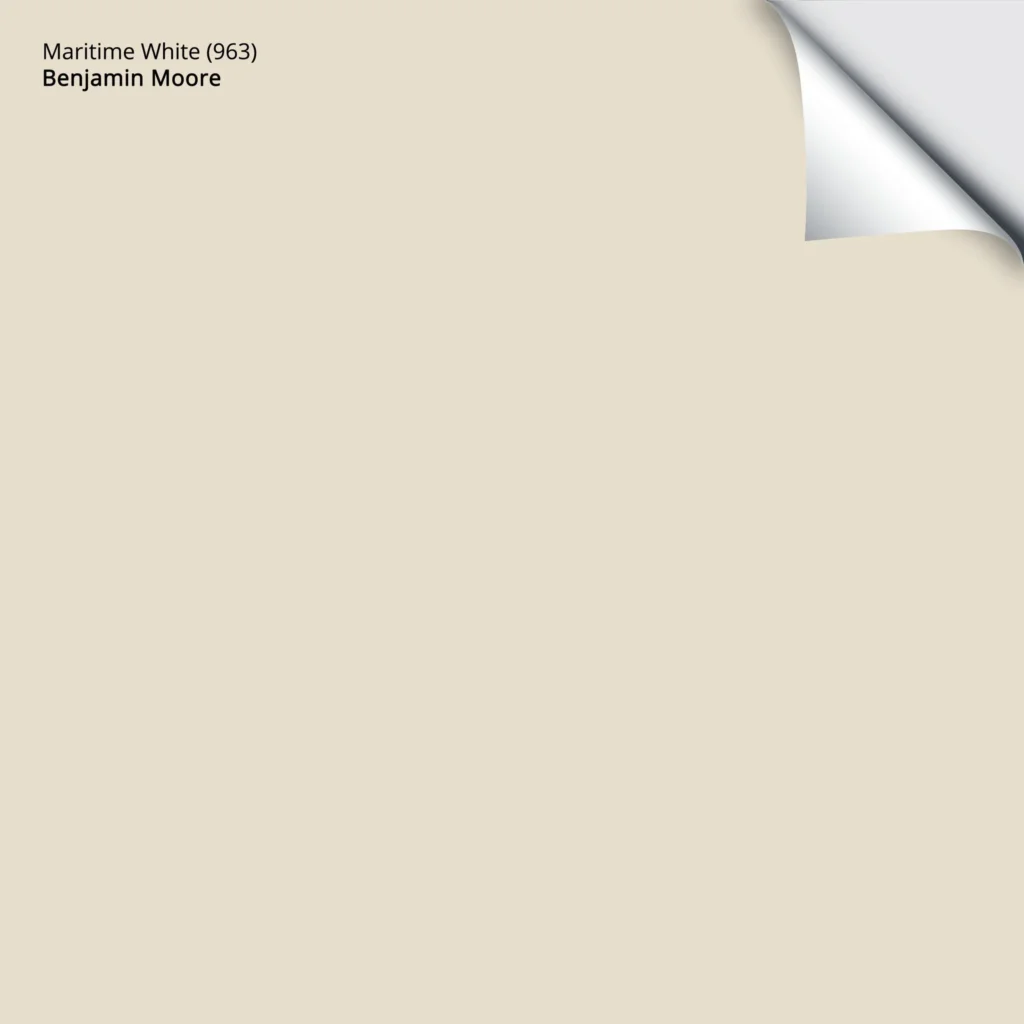
Benjamin Moore Maritime White Color Review
6. SHERWIN WILLIAMS CANVAS TAN SW 7567
Sherwin Williams Canvas Tan is a beauty. In the world of tans, it’s one of my favorites because it doesn’t go overly golden or flatten out. It’s soft, warm, and simple with a noticeable, but usually manageable, undertone.
6-PART SERIES: How to Update Your 2000s Home
Canvas Tan has an almost creamy-looking backdrop (that won’t flash pink—a common concern). Once in a blue moon (or a green one might be more the point), it can pick up a wink of green, but more often when it’s up against finishes with a pink undertone.
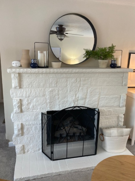
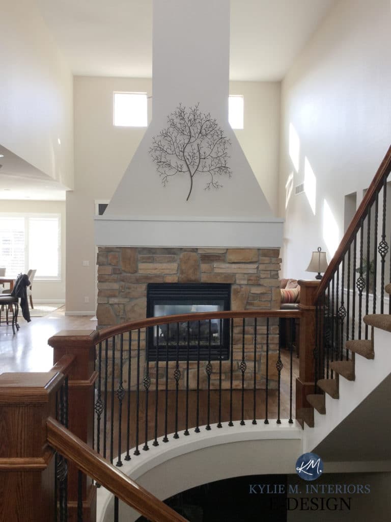
Affordable Fireplace Update Ideas
Canvas Tan has an LRV 65, so it has more meat on its bones than some of the lighter colors we’ll be exploring. However, it’s smack-dab in the middle of my happy range.
Just keep in mind that more interior finishes suit an orange undertone over yellow (sample and compare carefully to see what your home loves!)
Looking at the photos above and below, you’d think they were different tans. Remember, lighting, exposure, and interior finishes make ALL the difference!

WHY CANVAS TAN IS A GOOD WHOLE HOME COLOR…
- Canvas Tan is a great happy medium between the yellow warmth of typical cream paint colors and many tans’ more subdued, subtle approach.
- Canvas Tan doesn’t have the strong golden (orange-yellow or orange-pink) warmth you’ll find in many popular beige colors. Instead, it caters to yellow with a dash of green. Sure, more interior finishes suit orange, but I wonder what YOURS suit best?
REVIEW of Sherwin Williams Canvas Tan
7. SHERWIN WILLIAMS NATURAL TAN 7567
Natural Tan runs in the same world as Canvas Tan; however, they have different approaches to the warm world. Whereas Canvas Tan has a slightly yellow-green base, Natural Tan has a bit more gray and barely noticeable undertones (at best).

Not only is Natural Tan less warm than Canvas Tan, but this gray cuts back the undertones. Personally, I like it much more.
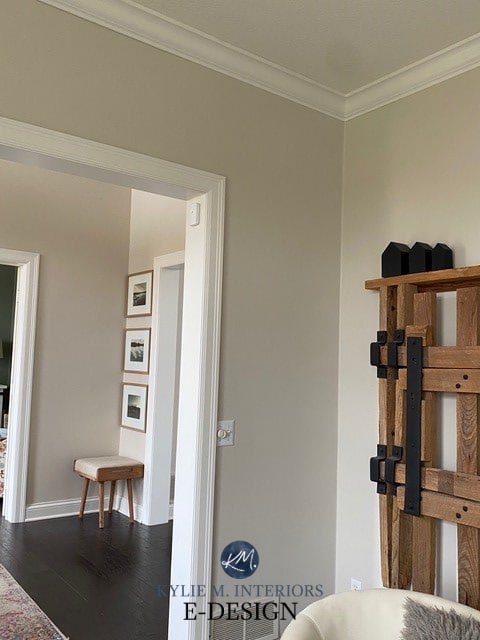
On the other hand, compared to the previously mentioned Accessible Beige, Natural Tan is lighter and warmer-looking. In this next photo, notice the difference between Accessible Beige (left) and Natural Tan (right)…
The WILD thing about Natural Tan is that while it can cater to a very vague green undertone, some people see it leaning slightly pink (more situational than actual, meaning it SHOULDN’T in the average home). This makes it a bit of a ninja and unpredictable – more reason to sample it carefully in your home with a large-scale peel-and-stick paint sample.
With its LRV of 65, Natural Tan is a light, warm neutral and great for many rooms and finishes.
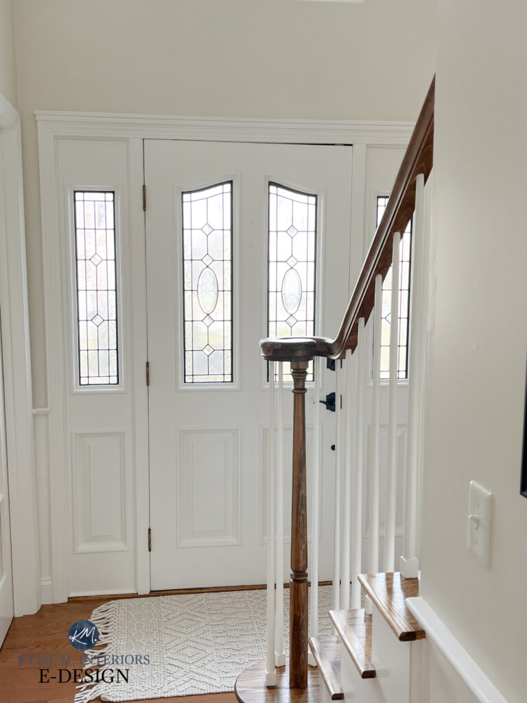
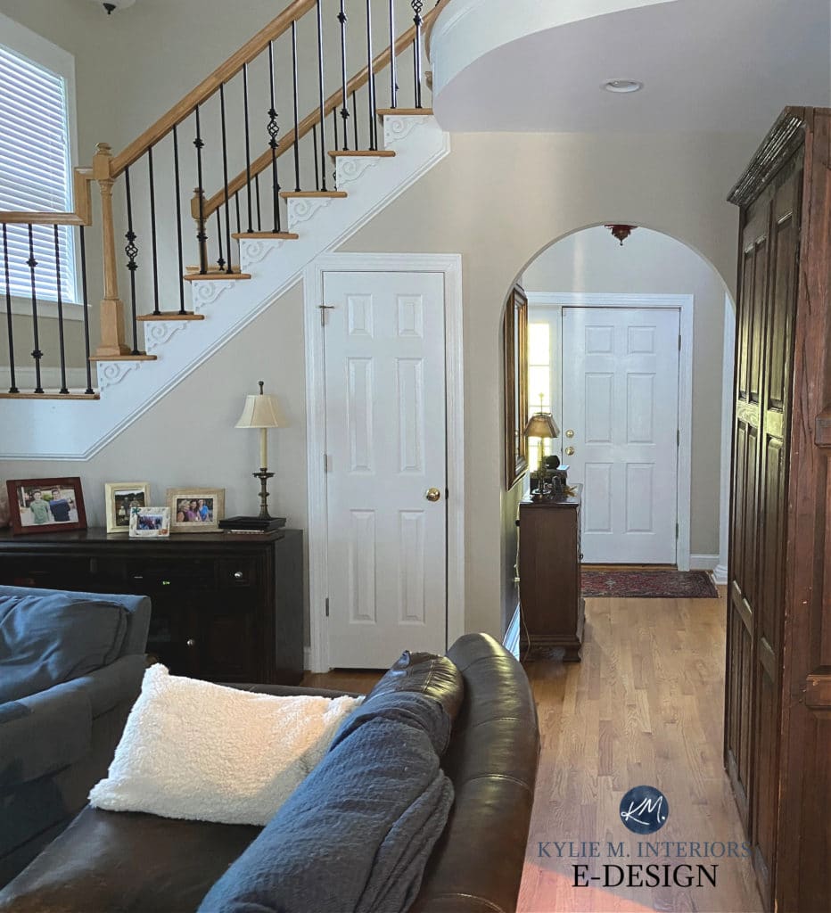
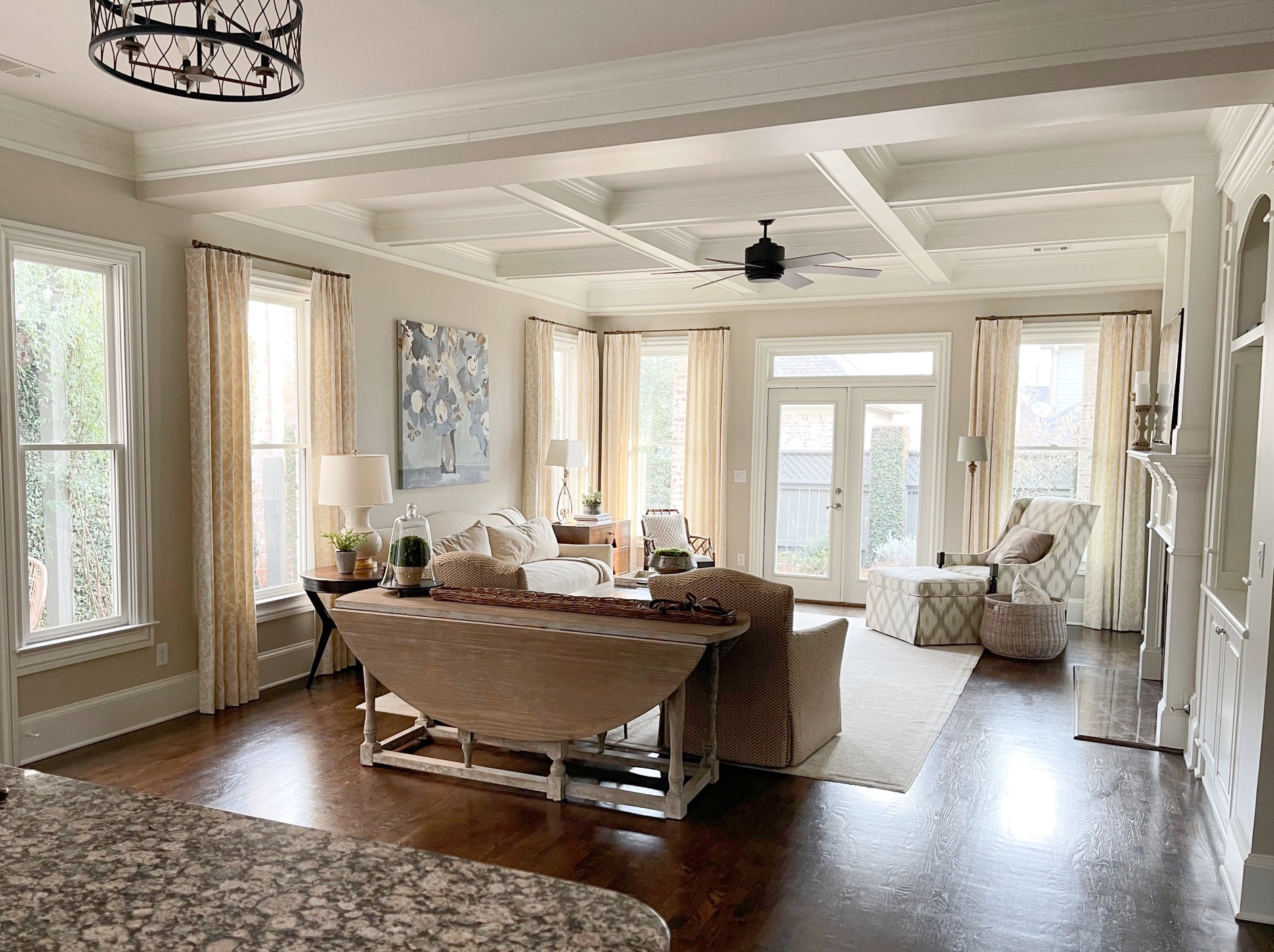
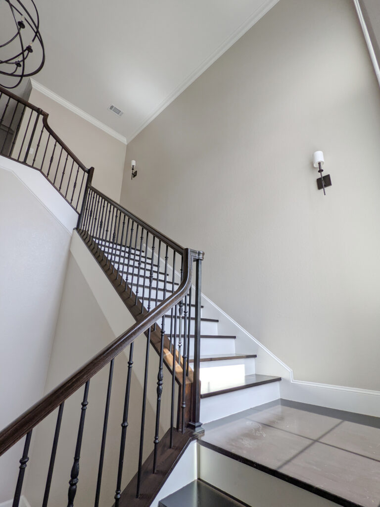
99.5% of the photos in my blog are of REAL HOMES from my Online Color Consulting clients, readers, and friends. While not always magazine-perfect, they’re packed with ideas and proven color choices to help you create a home you’ll love.
Review of Sherwin Williams Natural Tan
8. BENJAMIN MOORE WHITE SAND OC-10
Like me, White Sand doesn’t get nearly enough attention. Stuck between the super popular Benjamin Moore Ballet White and the darker look of Clay Beige, White Sand gets passed by.
I love White Sand, as while it’s a tan (yellow undertone), it’s incredibly passive and doesn’t carry its undertone with any strength.
Here’s your Peel & Stick sample of White Sand…

Compared to another popular color, Benjamin Moore Manchester Tan, White Sand is lighter and gentler, which is why I chose it instead. It’s most comparable to Sherwin-Williams Canvas Tan, but I like it more, as its yellow-green undertone is greatly reduced.
WHY WHITE SAND IS A GOOD WHOLE-HOME COLOR…
- Its LRV of 66.95 suits the average room, as it’s not too light or too dark.
- While it has a noticeable warmth, it’s not overwhelming.
- Its undertones are subtler than many other popular tan paint colors.
The Best Warm, Off-White Paint Colors
FREQUENTLY ASKED QUESTIONS
Here are some of the most common questions and concerns I receive in my inbox…
IS IT A GOOD IDEA TO PAINT YOUR WHOLE HOME BEIGE?
It depends. If the finishes in each room suit the same beige, then yes, it’s a great way to establish flow and consistency on a whole-home scale. However, some people use the same color, even if it clashes with the odd room. In this case, it’s best to use a 2-3 color palette.
As for trends, right now, painting your whole home beige makes sense, as warmer shades are in style. But, as with everything (especially trends), consider moderation. Maybe paint your main living areas beige, but try something a bit different in secondary rooms.
WILL BEIGE MAKE MY HOUSE LOOK DATED?
Potentially, yes. If your home was built in the early to mid-2000s and has a lot of beige finishes, the WRONG beige could date your home, for sure. This includes beiges that are slightly darker and richer, whereas lighter, more transitional shades can help update your home!
A color like this won’t do your home any favors in the ‘updated’ department.
WHAT UNDERTONE SHOULD I USE FOR A ‘WHOLE HOME’ BEIGE?
The majority of homes that suit warm neutrals prefer a beige with an orange-pink undertone. It doesn’t always need to cater hard to pink, but it’s far more common and popular than orange-yellow.
WHAT’S THE BEST WHITE TRIM COLOR WITH A WHOLE HOME BEIGE OR TAN?
That’s a darn loaded question. The best white depends on the exact wall color you choose and what suits your interior finishes. Generally speaking, here are the ones I usually look at: Sherwin Williams Pure White and Alabaster. Benjamin Moore White Dove and Chantilly Lace.
QUICK SUMMARY (TL;DR)
- Subtle beiges are great for ‘whole home’ colors, so long as they suit varying interior finishes and lighting conditions.
- As far as beiges go, the best LRV range (depth) for the average home sits between 65-73 (give or take).
- Popular shades include Benjamin Moore Muslin, Maritime White, Sherwin-Williams Natural Linen, and Natural Tan.
READ MORE
The Best Whole Home Off-White Paint Colors
The Best Whole Home Greige & Taupe Paint Colors