
The Best Paint Colors For a Calm, Focused Home Office (Blues & Greens)
The best paint colors for a home office are often (but not always) those that create a calm, focused, stress-free workspace. For this approach, homeowners often reach for blue and green paint colors. Lighter shades often give a fresher, relaxing, calming vibe, while darker blues and greens are popular for moodier, dramatic spaces. It really all comes down to color, temperature, and depth.
This is why it can be daunting to choose just ONE…SINGLE…COLOR. Light or dark, colorful or neutral? Relaxing, soothing, and inviting, or dramatic, bold, and moody?
This is also why doing your research is important (thanks for coming!). We’ll start by setting some guidelines (which we’ll do next). After that, we’ll walk through my color suggestions from light to dark to help you find the best home office color.

Remember, I’m not just here to tell you about pretty colors, I’m here to help you figure out what color you’re even LOOKING for.
I actually started this blog post with a wide range of colors in mind – blues, greens, neutrals, black, and white. However, it got overwhelming, fast. Instead, I decided to focus on blues and greens, seeing as they’re popular for home offices. We’ll save neutrals for another day.
Here are five important things to consider before you even start sampling…
1. WHAT MOOD OR FEELING DO YOU WANT IN YOUR OFFICE?
Assuming you’re creating this space for little ole you, spend some time considering the feeling you want to create.
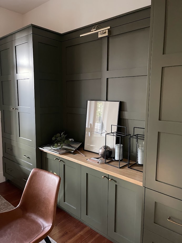
CONSIDER KEYWORDS LIKE…
- Cozy, inviting, soft, mellow
- Productive, focused
- Stress-free, relaxed, calming
- Simple or striking
- Inspiring, energizing
- Creative, mood-lifting, cheerful
- Moody and dramatic or subtle and soft
- Stylish, sophisticated, and professional
Or any other words that hit ye old noggin’. Try to choose 3-4 that hit the spot.
If your keywords focus more on an exciting, high-energy office space, well, that’s another blog post entirely. This blog post is geared towards a more calming, stress-free, focused vibe.
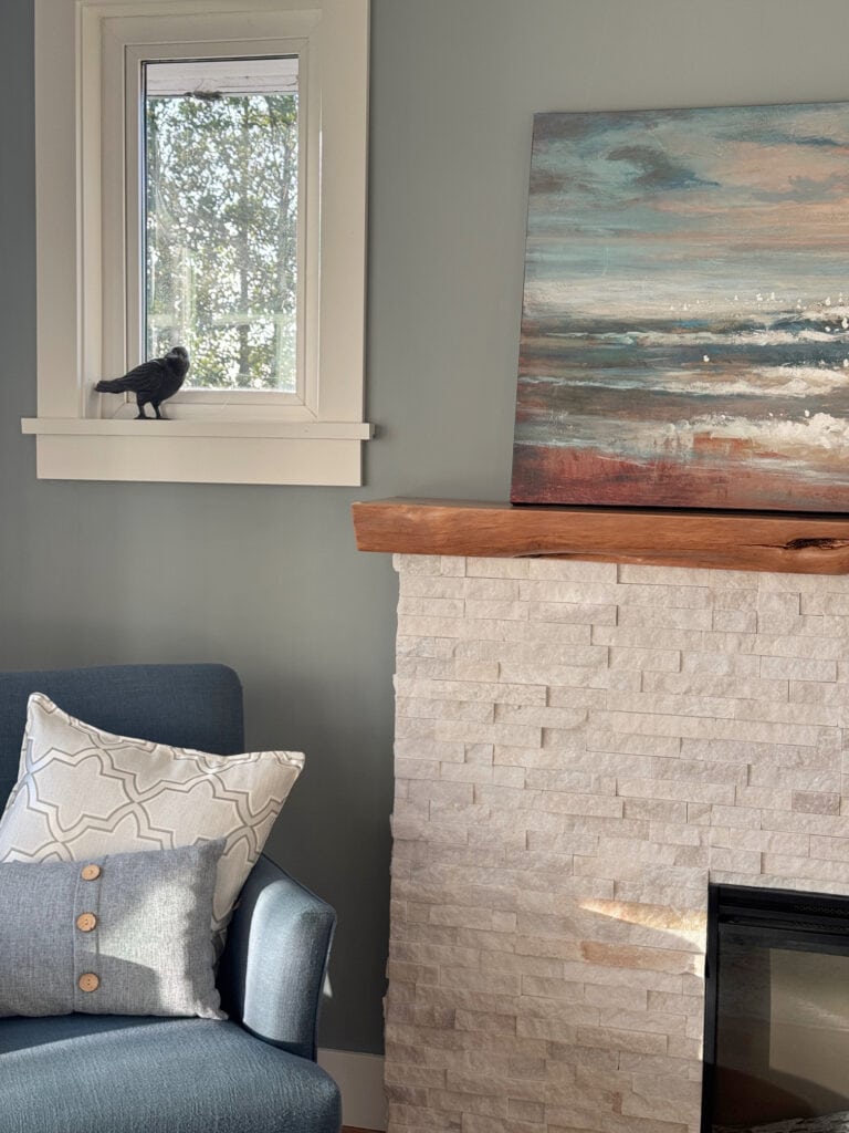
THEN, CONSIDER YOUR COLOR OPTIONS
Once you have a baseline vibe, consider what colors make you FEEL that way. It’s not a one-color-fits-all sitch. What’s calming and soothing to one person is wretched for another. You do you, boo.
Books have been written about color psychology, but how do YOU feel about the colors you want to work in?
With a focus on ‘calm, focused, and stress-free home offices’, these color palettes often include…
- Light, but muted blues and greens (not icy blues, which can seem unfriendly)
- Light greiges with stronger green undertones
- Sage green
- Creamy, warm, simple whites or off-whites
- Dark, earthy shades of blue, green – no strong, overpowering ‘colors’.
- Grays with stronger undertones (not dull, icy, or flat grays), including lighter and darker shades
- Professional offices are often the most neutral/least colorful
Again, this blog post focuses on blues, greens, and blue-green blends. And because they’re so closely related and uber popular, we’ll also look at grays that lean heavily toward blue-green.

While you can use the medium to darker shades on your walls OR your desk, cabinets, or built-in bookcases, the lighter shades are often best for walls only.
If you want a different color, finish reading this blog post (you never know what you might fall in love with). Then go to my SEARCH and type in the color you’re looking for – I’ve got 600+ articles full of inspiration!
2. THE SIZE OF YOUR ROOM
Do you have a small office, or is your space so big that it’s overwhelming? Based on your room’s size, do you want it to look cozy and inviting, big and bold, or motorboating in the ample bosom between cozy and cute and big and bold?
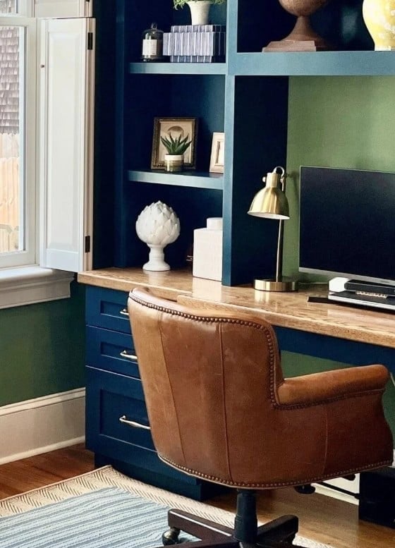
When it comes to size (because it matters), let’s look at what colors can do for you…
- LIGHT COOL colors help a space look bigger
- WARM DARKER colors can make a space look more intimate and smaller
- And yes, there are glorious places that sit right in the middle of both (cooler-darker, lighter-warmer); the above are just some baseline considerations.
If you ask this color cowgirl, the greatest focus should be more on the feeling and mood you want in your office. Then, use color to achieve that (regardless of whether it looks bigger or smaller)…
3. IS THERE ENOUGH NATURAL OR INTERIOR LIGHTING?
Whether your office is small or big, the quality of light it receives is important. Why?
Because without LIGHT, no paint color will save you.
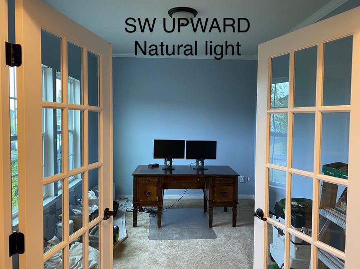
Luckily, whether you’re a basement dweller with no windows or don’t have a great interior lighting set-up, some solutions aren’t at all color-related.
IMPROVE A LOW-LIGHT OR DARK OFFICE
If you have a dark office, consider how you might improve your interior lighting (do this before you choose a color). This can include:
- floor lamps
- table and desk lamps
- wall-mount, battery-operated fixtures
While I could go into the Kelvins of your light bulbs, the color of your lampshades (white is best for bright), and so on, you get the idea.
As God once said…LET THERE BE LIGHT! (I’m not religious, but that God, he has some great one-liners).
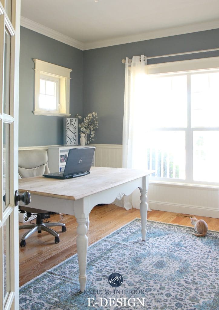
4. IS YOUR OFFICE FOR COUNSELLING, THERAPY, OR CONSULTING?
If clients come to your home office, what feeling do you want them to have? Think about the work you do and the colors that are most often associated with that.
While you can’t hit every person’s moods, you can get a good baseline using basic color psychology.
One of the worst things you can do is make it feel like a stark, cold Doctor’s office. Consider your color carefully – blues, greens, and blue-green blends are a fantastic starting place.
(BTW, if you’re a therapist/counselor/etc. and want me to write a blog post, leave me a comment – I need to know if there’s demand!)
MOVING ALONG!
5. PLEASE, CONSIDER CONTRAST
Contrast can’t be underrated when choosing a palette for your home office. If you aren’t familiar with contrast and how it works, here’s the meat n’ potatoes (with a little gravy).

LOW-CONTRAST PALETTES
Low-contrast palettes are most often associated with a feeling of calm. These stress-reducing combos leave less room for the eye to jump from one tone to another.
If you entertain clients in your office (minus the floor-to-ceiling pole), low-contrast palettes are often best, especially for counselling, therapy, medical or massage.
- This light-on-light palette is super low-contrast and calming (for many people)
- This office is low-contrast as the desk/cabinets, countertop, and flooring don’t pop with each other.
- Low-contrast can also be dark-on-dark.
- Visit the girls at Willoby Way for lower-contrast office inspiration!
MEDIUM-CONTRAST PALETTE
A medium-contrast palette is between both worlds. While there may be some blending, other features will stand out to a moderate degree.
These spaces can ‘sometimes’ feel a bit more cozy and inviting compared to low-contrast palettes (but it can totally depend on the colors/finishes/decor).
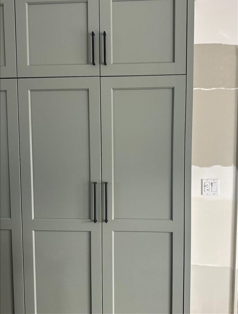
- This blue-on-wood office offers a soft, medium-contrast. While the built-ins and floor are of similar depth, the warm wood contrasts with the cool-toned cabinets.
- Here’s a gorgeous, low to medium-contrast home office.
- This small office is medium-contrast.
I only have so many images of home offices (I only use images sent to me or taken by me on my blog). This is why I’ve included a few Pinterest links.
HIGH-CONTRAST PALETTE
High-contrast home office palettes add energy, which can increase productivity for some (like me), or overwhelm others.
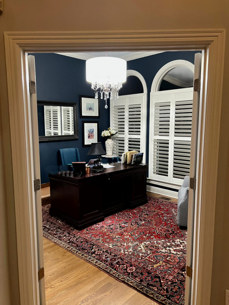
- Even though this office has higher contrast elements, it still has a calming vibe to me (what do YOU think?)
- These dark cabinets against the white walls are high contrast.
DO YOU HAVE ADHD?
I wanted to focus on this for a specific reason. I have ADHD (and OCD/anxiety).
If you don’t have ADHD, feel free to skip this. If you do have ADHD, STAY WITH ME, don’t get distracted (wink wink), as I’ve got some thoughts to share.
I work in my home office approximately 6-10 hours every day – I have an amazing hyperfocus once I sit down at my desk (yes, I do forget to eat and go to the bathroom – that’s what Depends are for, right?). I’m also super sensitive to my environment and how it FEELS.

This isn’t my office – mine is under construction right now
Personally, my brain responds very well to dark colors (for grounding), and I absolutely NEED some contrast. I have high-contrast settings throughout our home – they ground me and calm me. So, for me, my ideal home office has a reasonable amount of contrast.
What does YOUR ideal home office look like?
This might be something you haven’t considered – the combos and colors that help you settle, focus, relax, etc.
- Do high-contrast palettes make you feel agitated, focused, or happy?
- Do low-contrast palettes help you be productive, or do they make you feel bored and uninspired – which can have you looking for distraction elsewhere?
For some, the palette of this next home office inspires creativity and excitement. For me, this type of color contrast and home decor would make me feel agitated and distracted.
How does it make YOU feel?

Find these two colors and their BM/SW dupes here: Color-Matching Farrow & Ball’s Most Popular Colors.
That’s Farrow & Ball Calke Green and Hague Blue – they’re badass, for sure. If these Hakuna your Ma-tatas and soothe your boobs (same thing, really), fill your boots; however, we’ll be looking at calmer shades.
Long story short, while it’s mental for everyone, it can be even more so for others. LISTEN to your innards. What do you want your paint color to DO for you?
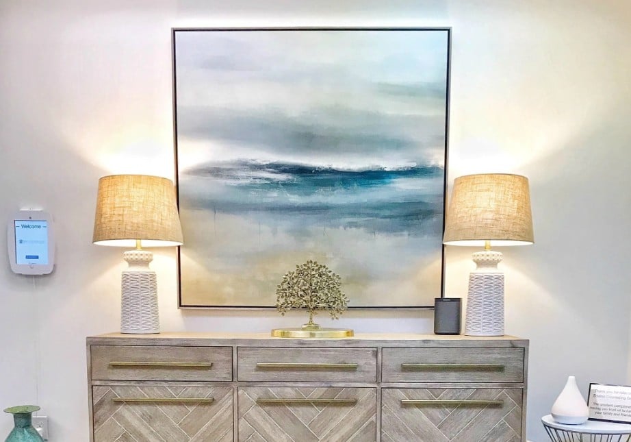
Eddins Counselling is one of my Online Color Consulting clients.
By the way, I’ve written a blog post on ADHD-friendly home office paint colors (slightly atypical ones). But regardless, if you love the idea of a calming blue, green, or gray with those undertones, the colors shown below could do the job.
Now, let’s get this color party started…
THE BEST GRAYS WITH STRONG UNDERTONES FOR A HOME OFFICE
While it’s an ‘each to their own’ situation, rather than committing to ‘color’, some prefer soothing, stormy ‘gray-centric’ colors, particularly gray-blues and gray-greens.
While some grays can look flat, dull, and uninspiring in a room, grays with stronger undertones offer a calming, restful vibe.
A color like this would have me visiting my therapist weekly – heck, I’d make up problems just to go!
- In the lighter range, these grays with blue-green undertones aren’t super popular for calming home offices (they can seem too icy/cold). Because they aren’t as in-demand, we’re starting with some soft, light-medium to medium-depths below.
- Once you get into the softer, medium-depths, and darker tones, these grays are popular for built-in cabinets, bookcases, and walls.

Some see these grays as more gray-centric, others see them as more colorful than gray. Either way, they can be gorgeous for a calming, low-energy, focused office space.
1. SOFT, MEDIUM-DEPTH GRAYS: BLUE-GREEN UNDERTONES
It’s hard to choose my favorites, as there are so many. Some lean more green, others more blue. Check out these links to see which ones grab your eye the most.
Some of the linked color names will go to my blog reviews. When I don’t have a review, the link will go to that brand’s site so you can at least SEE the color!
One of the best gray-blues, that also happens to be a bit lighter, is Sherwin Williams Uncertain Gray, shown on these painted cabinets below. Pairing them with a butcher block countertop would add a gorgeous contrast.

Sherwin Williams Earl Gray is also uber fab. It’s a stormy, medium-depth gray with green-blue undertones (more green than blue) that add a coastal, calming vibe. Compare that with Benjamin Moore Puritan Gray (everything I’d ever want in a blend) to see a huge shift in commitment to undertone.
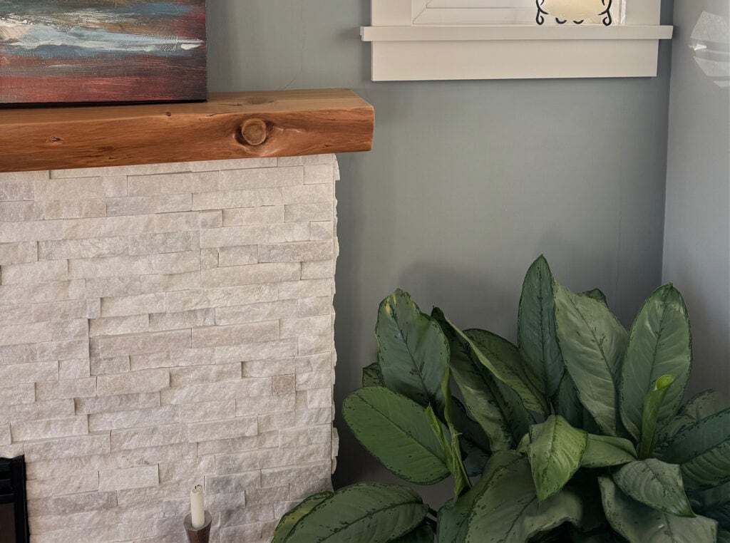
All of these colors look gorgeous with a wild and wide range of whites, along with flexible, warm off-white paint colors.
Next, let’s go a bit more green-gray with Storm Cloud Gray…
While Storm Cloud Gray can look like the above cabinets, it can also pick up a bit more green.
You’ll absolutely want to compare Storm Cloud Gray to Benjamin Moore Gray Horse, which has similar intentions, but takes you a good tone lighter…
Benjamin Moore Silver Mink is gorgeous for its blend of blue, green, and gray (think coastal and beachy). For more gray and blue, compare it with Adagio.
If we swing things a bit more gray, Sherwin Williams African Gray is by far one of the best options. The slightly lighter Network Gray is beautiful too (I did it in one of our bathrooms and our laundry room)…

While this isn’t a home office, it’s my old bathroom – I did some of my best work in this room, if you catch my drift (Network Gray)
If you like a slightly lighter look with decent green-blue hues, Sherwin Williams Unusual Gray is stunning. For a lighter look, if you’re so inclined, Magnetic Gray is pretty with its smoky gray backdrop.
Grays like these often thrive when paired with warm whites and flexible, warm off-white paint colors.
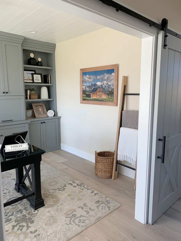
2. DARKER GRAYS WITH BLUE OR BLUE-GREEN UNDERTONES
There are so many badass and beautiful dark shades – especially for the cabinets, desk, or bookcases in an office.
Sherwin Williams Foggy Day – I can’t even. I painted this on the board-and-batten in our home, and I’m obsessed. For more depth and body, Grays Harbor is beautiful and can seem a touch bluer. Here’s Gray’s Harbor in one of the kitchens of Studio McGee.
99.5% of the photos in my blog are of REAL HOMES from my Online Color Consulting clients, readers, and friends. While not always magazine-perfect, they’re packed with ideas and proven color choices to help you create a home you’ll love.

Here’s Foggy Day in our upper hallway with Benjamin Moore White Dove
To lean more into a gray-blue (dropping the green entirely), Benjamin Moore Ashland Slate is pretty skookum and my go-to for this range. Compare it to the slightly grayer Charcoal Slate. For a bit more balance between blue and green, check out Sherwin Williams Web Gray.
Benjamin Moore Stonybrook offers a lot and has a range of personalities (like me) that span green-gray, blue-gray, and sometimes all three!

If your favorite grays are heavier on the green, Sherwin Williams Homburg Gray offers a gorgeous look (it’s a bit tealish and maybe a touch colorful for the section, but that’s okay). For even more green, Grizzle Gray is amazeballs, as shown below.

That said, if I’m looking at colors like Grizzle Gray, I’m DEFINITELY looking at dark greens, too (coming up shortly), as there are a few stunners that aren’t overpowering.
The Best Neutral Paint Colors for a Home Office
Now that we’ve exhausted that range, let’s move along to the stars of the show…
THE BEST LIGHT BLUE & GREEN PAINT COLORS FOR A HOME OFFICE
If your perfect home office includes a slightly more colorful, committed blue, green, sage green, or blue-green, let’s move things along.
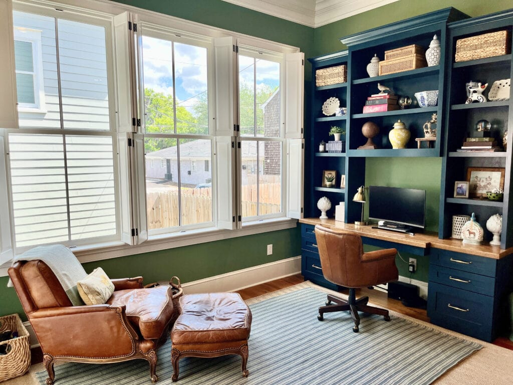
However, it’s not just any ole shade that works. The best paint colors for a calming home office are often…
- Muted and earth-toned – nothing drastically colorful.
- Blues and greens thrive across the light, medium, and dark ranges. Darker blues and greens are often popular with creative types, as well as men!
- Lighter shades are often best kept to walls.
- Medium to darker shades suit walls, as well as cabinets, desks, and built-in bookcases.
- Blue-greens are far more popular than blue-purples.
1. LIGHTER BLUE PAINT COLORS
Because blues with green undertones (and a degree of gray) are the most popular, let’s start our adventures with Benjamin Moore Woodlawn Blue. This is light with a soft green-gray backdrop. If you prefer a bit more color, check out Gossamer Blue, a slightly more cheerful shade.

Remember, the icier a blue is, the less inviting it looks. As shown with Benjamin Moore Blue Lace, below, which is on the edge of icy, be careful how cool you go.

Instead, I might sample colors like Sherwin-Williams Tradewind, which gives a beautiful blue look, with less of an icy backdrop. If you want more depth, hit up Sherwin Williams Rain.
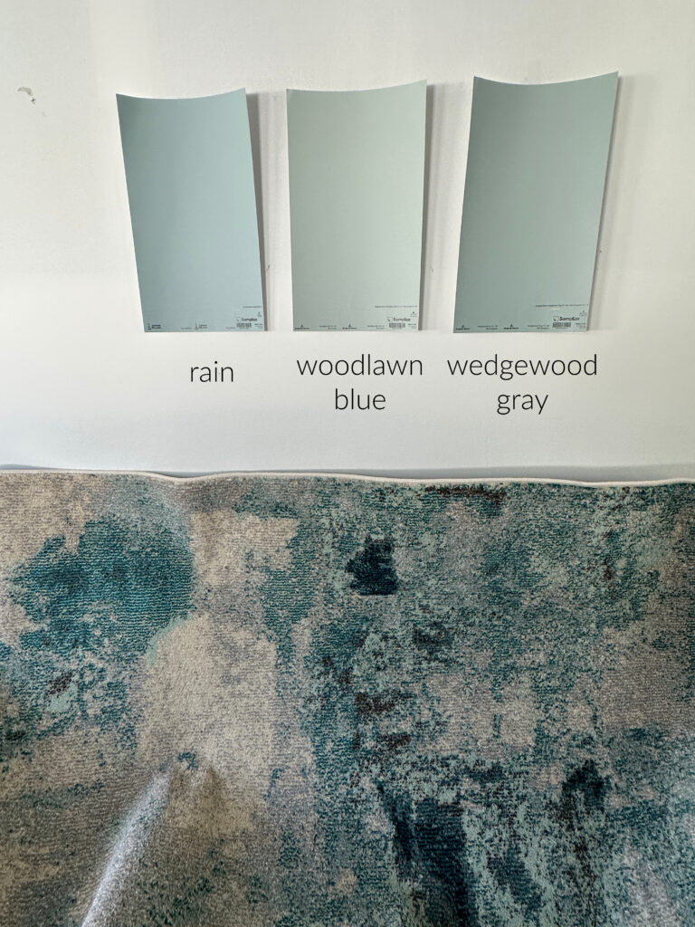
Shifting things toward a more blended approach, Benjamin Moore Quiet Moments is great for a coastal kind of calm. The comparable, but bluer, Benjamin Moore Pale Smoke is equally as pretty.
The Best Light Blue Paint Colors
2. LIGHTER GREEN PAINT COLORS
Green paint colors are well-known for their calming properties. Let’s start with some gorgeous, grounded, organic ones.
Benjamin Moore Paris Rain and Vale Mist are muted light greens that can create a calming home office vibe. Compare the two to see how Paris Rain has a more organic warmth compared to the more balanced Vale Mist.

The Best Paint Colors With Golden Oak Finishes
To add contrast to your palette while still keeping it organic and calming, pair your light green with a slightly stronger wood tone. For a soft approach, white furniture can be simple and professional.
For a more gentle warmth, Sherwin Williams Ancient Marble (below) has a greige backdrop and a light touch, while Grassland offers a bit more green/depth.

If you want a slightly cooler look, Sherwin Williams Contented is a nicely balanced green-gray with an almost spa-like vibe. While it’s not warm, it’s super chill…in a good way. And you MUST compare it to Sherwin Williams Austere Gray (I am a bossy lil’ Ginger)…

Admittedly, the above two green-grays could’ve easily gone in the more ‘gray-centric’ section, but c’est la vie, which is French for…MOVING ALONG!
The 20 Best Green-Gray Paint Colors
3. LIGHTER BLUE-GREEN COLORS
Sherwin Williams Rainwashed offers a bit more green than the previously mentioned Woodlawn Blue. For a bit more depth, definitely check out Quietude – it’s wicked pretty.

Blue-greens can be gorgeous, especially if your home office doubles as a guest bedroom.
For colors that can lean a bit more green, but still have a strong blue in the backdrop, try Sherwin Williams Comfort Gray and Sea Salt.
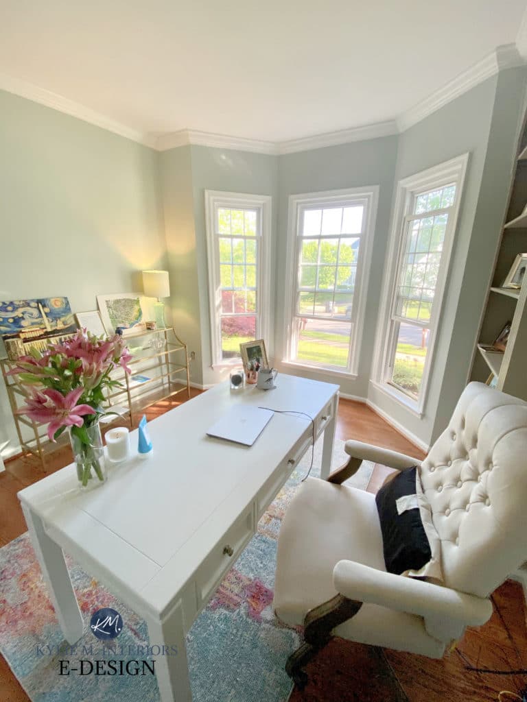
Notice how the color shifts from green on the left to a bluer hue on the right.
Benjamin Moore Gray Wisp is a badass beauty, with a nice blue-gray backdrop, as is Imperial Gray, which offers a bit more depth.
Would I go as colorful as Benjamin Moore Palladian Blue? Personally, no, but if YOU like slightly more colorful shades, it could hit the spot.
Here’s a Peel & Stick sample of Palladian Blue…

THE BEST MEDIUM-DEPTH BLUE & GREEN PAINT COLORS
If your idea of calm and collected has a bit more depth, let’s look at some medium-depth options.
- These colors can be fabulous on walls.
- For a moderate to high-contrast look, pair them with white trim and furniture. For a bit more moderation, use a muted wood stain.
- To increase the contrast, choose a stronger, more striking wood stain.
1. MEDIUM-DEPTH BLUE COLORS
Medium-depth stormy blues are super appealing. Unlike lighter blues and greens (which are touch-and-go on anything but walls), they work on built-in desks, cabinets, and bookcases, too!
Let’s start with Benjamin Moore Mount Saint Anne, which is a stormy, calm shade with just the right amount of blue to be interesting. If you want something a bit lighter, bump your cute lil’ butt up to Beach Glass.
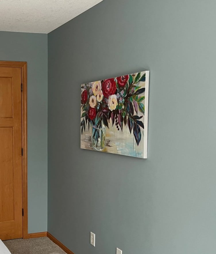
While Mount Saint Anne looks a bit green in the above image, it can swing much more blue – sample it in your home and compare it to similar shades.
Sherwin Williams Cadet is another gorgeous shade. Blue, gray, and a splash of green for sharts n’ giggles. In a lower-light room. even a slightly more colorful blue like Sherwin Williams Stardew can come off more smoky and relaxed…

The Best Light to Medium Blue-Gray Paint Colors
2. MEDIUM-DEPTH GREEN PAINT COLORS
Sherwin Williams Evergreen Fog was a Color of the Year for good reasons (and is still going strong). With a natural vibe and gray backdrop, it settles in really well.
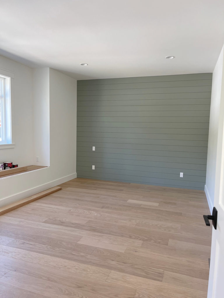
Even though the wood floor and warm white walls contrast somewhat with Evergreen Fog, the look is still calming and grounding to many.
For a bit more interest, take a look at Sherwin Williams Coastal Plain, which offers more color without going too far (for some, it’s too green for me).
Greens like these can look gloooorious with warm white paint colors.
For a bit more warmth, the more committed green hues of Clary Sage and Green Onyx can be interesting. I’d be far more likely to use these greens on walls than on cabinets.
Here’s your Peel & Stick sample of Clary Sage…

Benjamin Moore Dry Sage and Creekside Green are two of my favorite shades of green, with Dry Sage being the warmer option.
As for Sherwin-Williams Retreat, it’s almost more of a blue-green blend, but I’m tossin’ it in this section because I can…

Not everyone needs a bright, committed home office – some moody spaces can do great double-duty!
3. MEDIUM-DEPTH BLUE-GREEN COLORS
If you aren’t sure whether you love blue or green, how about a blend? While many of the previously mentioned blues have some green, I want to hit that range a little harder.
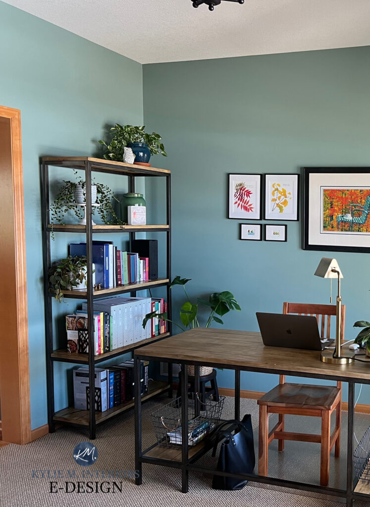
Remember, opposites attract and can make each other stronger (more contrasting). Notice how the warmth of the wood trim contrasts with the blue-green walls…
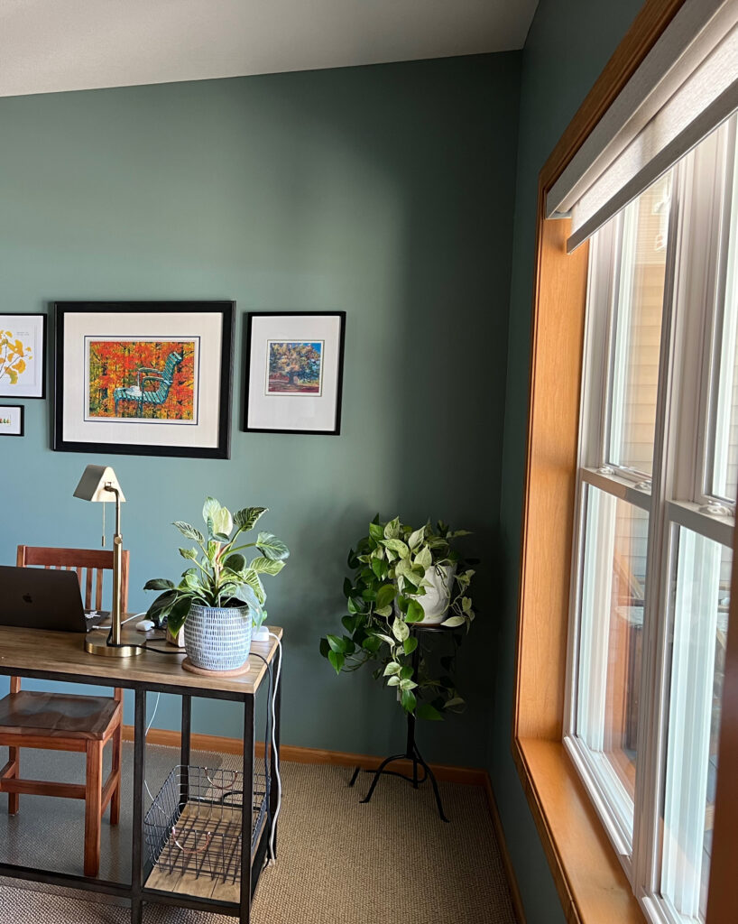
As far as medium-depth blue-greens go, I have mad love for Benjamin Moore Knoxville Gray. Not to gray, not too blue-green. The slightly lighter Templeton Gray is worth comparing as well.
For moderate contrast, pair your chosen blue or green with a warm white or flexible warm off-white. A wide range of lighter greiges and taupes can be wicked pretty, too.
Benjamin Moore Steep Cliff Gray is a stunner with a bit more blue than the above two. Check out its lighter version, Cloudy Sky, too.

Benjamin Moore Gibraltar Cliff’s Color Review
If you missed Foggy Day (mentioned in the gray-blue-green section), check it out, along with the darker Grays Harbor. Get your eyeballs on Grays Harbor in this kitchen designed by Shea McGee.
Lastly, take a look at Benjamin Moore Sea Star with its slightly more colorful commitment…
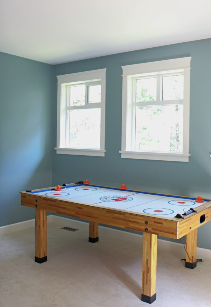
4. MEDIUM-DEPTH SAGE GREENS
Benjamin Moore Saybrook Sage is a classic in the sage green world. It’s not my personal fave, but you do you – if that’s your kinda calming, that’s all that matters. And yes, I have a lot of personal opinions. If you disagree with them, I forgive you.
Here’s your Peel & Stick of Saybrook Sage…

I’d rather choose a green that was the Color of the Year 3 years ago – a color that’s STILL POPULAR – Benjamin Moore October Mist…
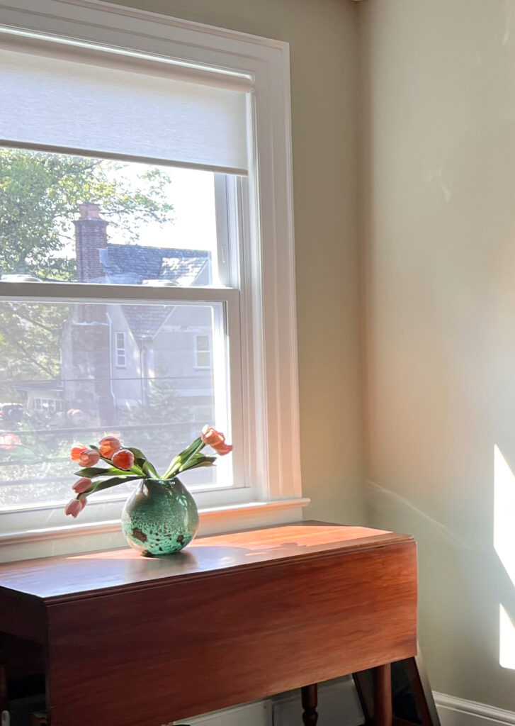
Remember, the more natural light you have, the lighter a color will look. The above image shows October Mist, but so does this next one…
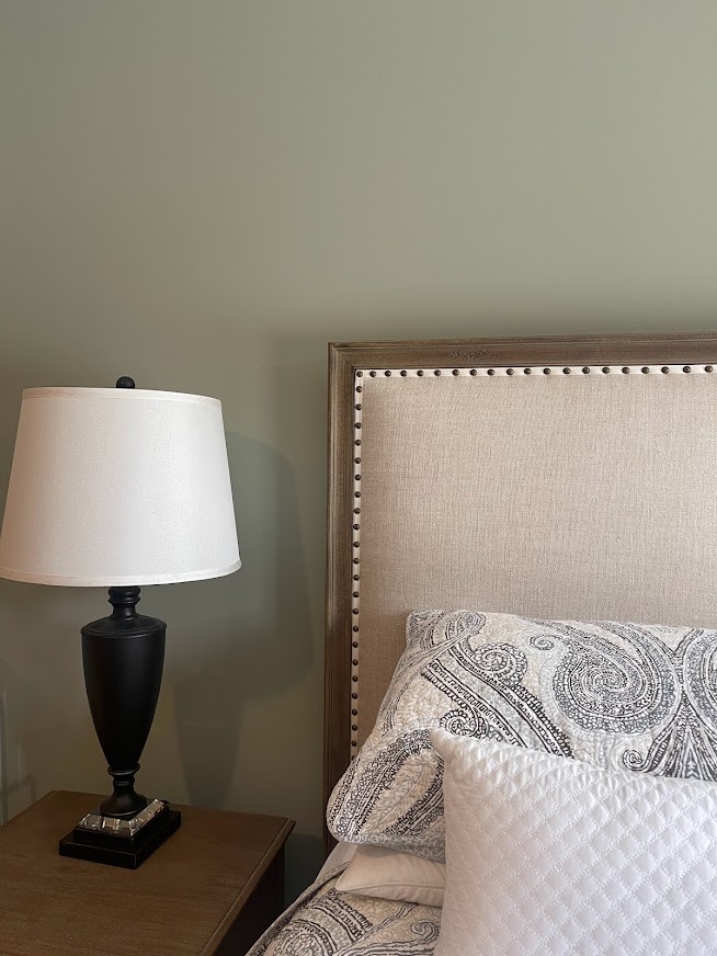
For a more complex green-gray-blue, check out Benjamin Moore’s Oilcloth, which offers a more grayed-out take on sage green.
While not everyone’s version of sage green is as warm as Benjamin Moore Nantucket Gray, yours might be, for a soft, welcoming office space…
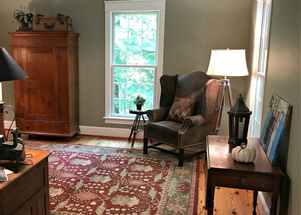
THE BEST DARK BLUES & GREENS FOR A CALMING OFFICE
This is definitely my favorite part of this blog post. While it’s each to their own, I lean toward darker green colors when I want a calming space.
When it comes to darker shades of blue and green, sure, they can work for your walls, but you might also consider them for your desk and cabinetry.

1. DARK BLUE PAINT COLORS
Dark blues can be classic and navy or a bit more grayed-out and muted. Your best paint color is the one that you look at and think, ‘ahhhh, I want to work in that space’.
It makes the most sense to start with Benjamin Moore Hale Navy, as it’s the most classic, timeless navy blue paint color.
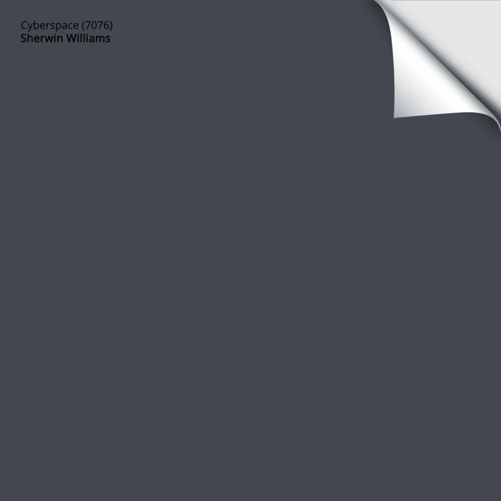
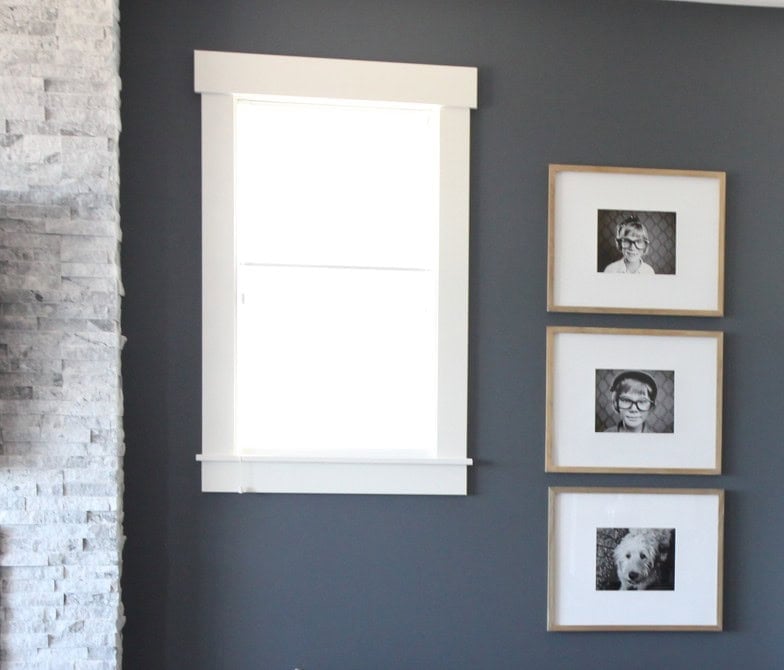
However, Hale Navy comes in a little hot for some people, in which case a more grayed-out color like Sherwin Williams Cyberspace can hit a million happy places – no batteries needed.
Here’s your Peel & Stick sample of Cyberspace…
You might also like a softer, lighter look, in which case Benjamin Moore Anchor Gray is amazing – grounding while still interesting. Compare it to Benjamin Moore Ashland Slate and Charcoal Slate for some great alternatives.
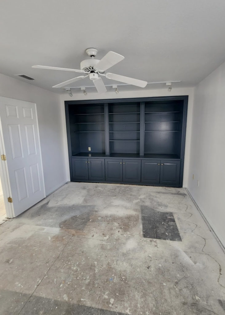
Another gorgeous, dark shade of blue is Benjamin Moore Ocean Floor, as shown on these office built-ins…
2. DARK GREEN PAINT COLORS
One of the best dark green paint colors is Sherwin Williams Night Owl. This dark green is well-grounded with gray and wicked pretty for cabinets. Remember Grizzle Gray from the dark gray-greens near the start? Probably not. Anyway, compare these two, for sure.
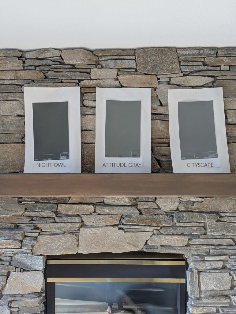
Sherwin Williams Attitude Gray | Cityscape’s Review
For those craving a little more green, Sherwin Williams Pewter Green is a gorgeous, darkish shade for cabinets, desks, or walls – heck, you can paint it on your toenails if you love it as much as I do (yup, even you, Bob – spread those piggies).

Could you go one step darker with Sherwin Williams Ripe Olive or Shade Grown? HELLLS YEAH, YOU CAN! However, I suggest built-ins/desk/bookcases rather than walls (again, you do you, boo).
As for Benjamin Moore Vintage Vogue, while it’s made a name for itself in the ‘green world’, if you ask me, it’s a bit too colorful to be calming – the greens on this page are better options.
For example, check out Benjamin Moore Dark Olive with its natural, muted, earthy, organic look. Sherwin Williams Cast Iron offers a similar look – I’d definitely compare the two.
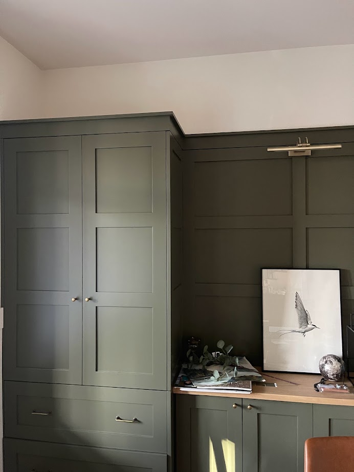
The Best Dark Greens: Sherwin Williams | The Best Dark Greens: Benjamin Moore
3. DARK BLUE-GREEN BLENDS
How could we POSSIBLY end this party without Sherwin Williams Still Water? This slightly jewel-toned blue-green blend is aquatic in its look, with enough gray to be calming.
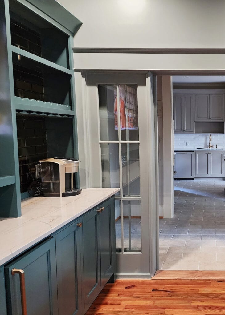

Because every home office needs a bar and a TV for Ryan Reynolds’ movie marathons.
As for Benjamin Moore Knoxville Gray, while it can live in the more ‘solid’ medium-depths, it also fits in the dark category, especially if your room isn’t super bright. Benjamin Moore’s Kitty Gray is like a ‘grayer’ version of Knoxville, if you like that look…

Kitty Gray is a bit more inclined to lean green, whereas it shows more gray-blue here.
Here’s Kitty Gray on a painted front door, offering another look at its overall approach…
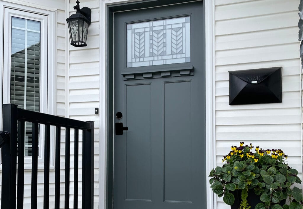
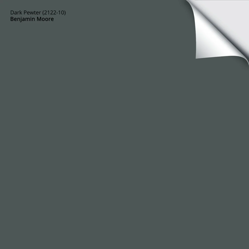
Benjamin Moore Dark Pewter is another moody Judy with a big ole booty – yup, she’s skookum. She’s kind of like Knoxville Gray, but with more black/depth.
Here’s a Peel & Stick sample of Dark Pewter…
For a higher contrast palette, pair your chosen dark blue or green with a warm white or flexible warm off-white. A wide range of greiges and taupes can be wicked pretty, too.
Another color we touched on earlier was Sherwin Williams Grays Harbor, one of my favorites as far as dark blue-green-gray blends go.
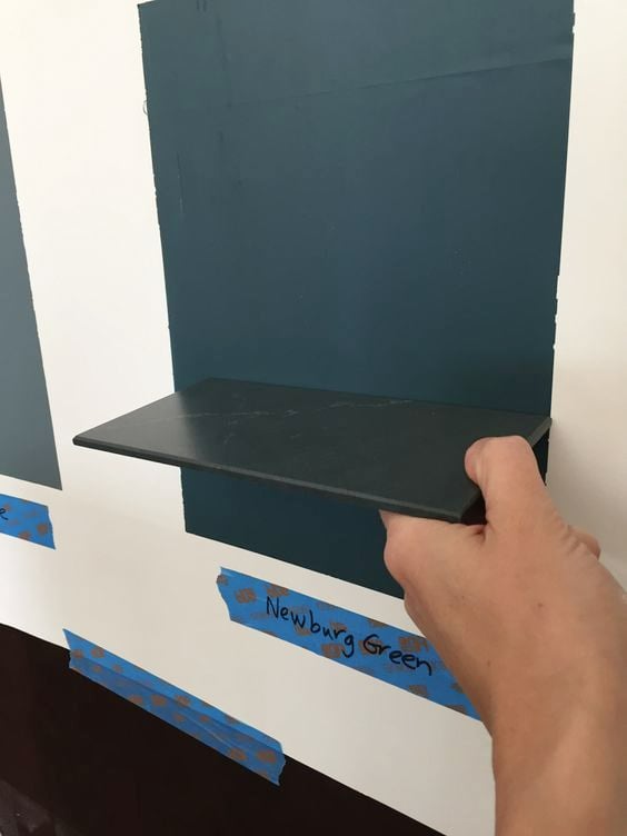
Benjamin Moore Narragansett Green is beyond stunning. While some prefer the lighter look of Newburg Green (below), I find it a bit too colorful/strong – Narragansett has my heart. I can’t WAIT for one of my clients (or readers – wink wink) to use it and send in photos!
QUICK SUMMARY (TL;DR)
- The best paint colors for a calming, stress-reduced home office are blue and green
- Consider contrast, lighting, mood, and room size when finding your best shade.
- Light blues and greens are often best for walls.
- Medium to dark blues and greens can be used on walls and cabinets, desks, etc.
PHEW, we did it! Thanks for hangin’ in there.
READ MORE
The Best Neutral Paint Colors for a Home Office
ADHD-Friendly Home Office Paint Colors
The Best Blue & Green Bedroom Paint Colors
The Best Calming, Stress-Reducing Paint Colors
How to Choose Paint Colors When You Have Anxiety
Get the best paint color advice with Kylie M’s Online Color Consulting




Great and really helpful post Kylie! Thank you!
You’re most welcome – Happy New Year!
What do you think of BM Silhouette for one bedroom wall behind an ivory bed?
Yes, would love to see a blog post for counselors/therapists offices. (Thinking of olive greens, tans, warm accent colors. Wanting to feel safe and relaxing; incorporating nature, etc.). I always look forward to reading your posts! Thank you.
Ooooo, I’d love to! Do you have any office photos you’d like to send me – I could use yours as an example! kylie@kylieMinteriors.ca
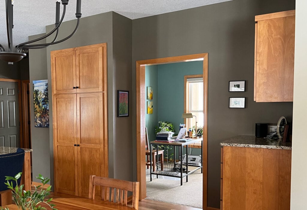
Kylie, great information, lots of examples and explanations. Curious, what is the color in the picture that has the kitchen cabinets, appear to be maple, with a built in wall cabinet. it’s in the “Consider your color options” section. Thank you!
Hey Louise! If it’s the kitchen with the darker kind of brownish, greige walls, that’s BM Texas Leather!
This is such a fantastic and thoughtful guide to choosing a home office color! I love how you focus on the *feeling* a person wants to create first, rather than just listing pretty swatches. Your breakdown of low, medium, and high contrast is incredibly useful for understanding how a room will actually feel to work in. The whole section on ADHD and personal sensitivity to the environment is something I’ve never seen in a design article before and is so, so valuable.
My question is about natural light, or the lack of it: for a home office with very little natural light (maybe just one small north-facing window), do you think it’s better to embrace the mood with a darker, cozy color like one of those beautiful stormy grays, or is it crucial to stick with a lighter, reflective shade to avoid the space feeling too cave-like?
Wow, thank you for such a thoughtful comment! So, low light and north-facing. Wellllll, it’s personal. I love cozy, inviting spaces with charm and personality. So, I might lean into something like, say…SW Foggy Day or SW Night Owl. THEN, I’d add some table/floor lamps (even Amazon battery-operated lights) to give teh room ‘ambience’.
Of course, you could go lighter, but you have to enjoy that look. PERSONALLY…it’s not for me, as you often need to add more to the room to make it feel good, as lighter colors can be a bit boring!